Family Dollar stands as a prominent name in the American discount retail landscape, offering a wide array of affordable goods. Since its inception in 1959, the Family Dollar Logo has played a crucial role in establishing brand recognition and conveying its value proposition to customers. This article delves into the evolution of the Family Dollar logo, exploring its design changes and the significance behind its visual identity.
The Evolution of the Family Dollar Logo: From Minimalist to Modern
The Family Dollar logo has undergone several transformations throughout its history, each reflecting the brand’s growth and evolving identity in the competitive retail market. Let’s examine the key stages of its logo evolution.
1959 – 1960: The Humble Beginnings
 Family Dollar Logo 1959
Alt text: Family Dollar original logo from 1959, featuring a monochrome text-based design with slightly tilted and overlapped letters and the slogan “Sale Prices Are Everyday Prices”.
The inaugural Family Dollar logo was a monochrome, text-centric design. It featured the company name accompanied by the slogan “Sale Prices Are Everyday Prices.” The lettering style was distinctive, employing slightly tilted and overlapped characters, which lent a unique, albeit somewhat informal, feel to the brand’s early visual representation.
1960 – 1976: Embracing Playfulness
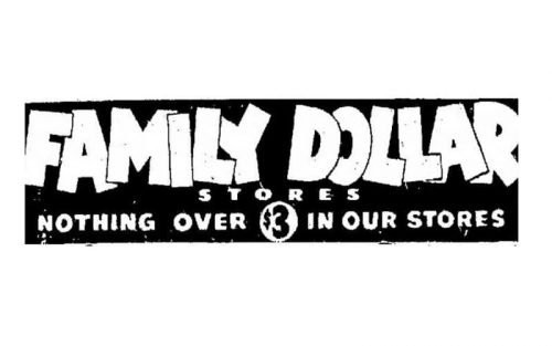 Family Dollar Logo 1960
Alt text: Family Dollar logo from the 1960s, showcasing a playful, cartoonish, extra-bold sans-serif font with overlapping letters for “Family Dollar” and a traditional font for “Stores”.
In the 1960s, Family Dollar adopted a more playful and cartoonish aesthetic for its logo. The font transformed into an extra-bold sans-serif style. The words “Family Dollar” were rendered with overlapping letters, maintaining a sense of informality, while “Stores” was presented in a more traditional, spaced-out font beneath, creating a contrast in styles within the same logo.
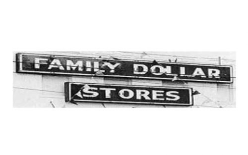 Family Dollar Logo 1960
Alt text: Family Dollar logo in monochrome from 1960, featuring two levels of text in rectangular frames, “Family Dollar” on top and smaller “Stores” underneath, both in a strong, professional font.
An alternative version from this era presented a more structured approach. It featured “Family Dollar” and “Stores” on separate lines, each enclosed within rectangular frames. Both parts of the wordmark utilized a strong and professional font, projecting a sense of stability and reliability, a departure from the overtly playful style.
1976 – 1983: Streamlining for Modernity
 Family Dollar Logo 1976
Alt text: Family Dollar logo from 1976, a minimalist design with thick black strokes, straight lines with slight curves, overlapped letters with a thin white outline, solely displaying “Family Dollar”.
The 1970s brought a significant shift towards minimalism and modern design. The logo was streamlined to simply “Family Dollar,” dropping “Stores.” The font was characterized by thick, black strokes, predominantly straight lines with subtle curves, and overlapping letters, now with a thin white outline to enhance legibility and separation between characters. This iteration exuded a more contemporary and stylish feel.
1982 – 1997: Red and White Takes Center Stage
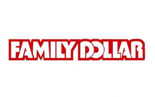 Family Dollar Logo 1982
Alt text: Family Dollar logo from 1982, featuring jumping letters now in a straight line, colored white with a red outline, and the word “Stores” removed, marking the introduction of the brand’s signature color scheme.
In the early 1980s, the logo adopted its now-signature red and white color scheme. The playful, “jumping” letters were aligned into a straight line. The lettering turned white with a bold red outline, creating a visually striking and memorable mark. The removal of “Stores” solidified “Family Dollar” as the core brand identifier.
1997 – 2008: Refining the Familiar
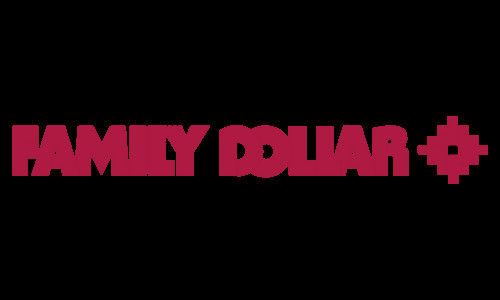 Family Dollar Logo 1997
Alt text: Family Dollar logo from 1997, maintaining the modern and stylish design with thick black strokes, straight lines with slight curves, overlapped and white-outlined letters, displaying only “Family Dollar”.
This period saw a continuation of the minimalist and modern design language established in 1976. The logo remained focused on “Family Dollar” in a stylish font with thick black strokes, a blend of straight lines and curves, and the distinctive overlapping, white-outlined letters. This suggests a period of brand identity consolidation, reinforcing the visual elements that were resonating with consumers.
2008 – Present: Adding a Symbol of Togetherness
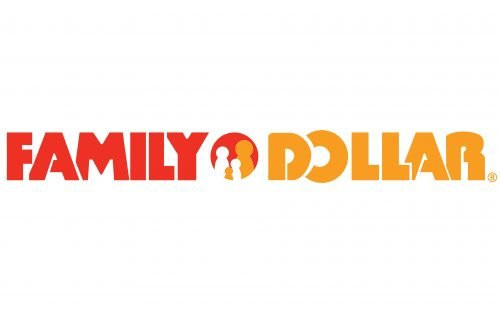 Family Dollar Logo
Alt text: Current Family Dollar logo since 2008, featuring the wordmark separated by a circle with an abstract family image in red, orange, and white, adding warmth and friendliness to the brand identity.
The most recent redesign in 2008 introduced orange into the color palette alongside red and white. A significant addition was the graphical element: a bold circle placed beside the wordmark. This circle contains an abstract representation of a family in red, orange, and white. This addition aimed to imbue the logo with a sense of friendliness, warmth, and community, aligning with the “family” aspect of the brand name and appealing to its target demographic.
Font and Color Palette: Reflecting Brand Values
The Family Dollar logo utilizes a bold, stylized sans-serif typeface. The uppercase letters, slightly overlapping, contribute to a distinctive and recognizable wordmark. While custom-designed, fonts like Basic Lettering JNL and Retail Price JNL Solid share similar characteristics. This font choice is strong and accessible, reflecting the brand’s broad appeal.
The color palette of red and orange, introduced and solidified over time, evokes feelings of warmth, energy, and love. These colors are strategically chosen to project the company’s approachable nature and its commitment to customer satisfaction. Red often signifies excitement and value, while orange adds a touch of friendliness and optimism, both key attributes for a discount retail brand aiming to create a welcoming shopping environment.
Conclusion
The Family Dollar logo’s journey reflects the brand’s evolution from a modest discount store to a nationwide retail chain. From its initial text-based logos to the modern, colorful emblem featuring a family symbol, each iteration has aimed to strengthen brand recognition and communicate its core values. The current logo effectively balances the brand’s name with a symbol of community and a warm color palette, reinforcing Family Dollar’s position in the discount retail sector and its appeal to families seeking value and affordability.
