
Selecting the right color schemes for your family portrait can feel like a daunting task, but it’s crucial for creating visually stunning and timeless photos. As a content creator for hudsonfamily.net and a family photography enthusiast, I understand the importance of color in capturing the essence of your family. This guide will walk you through selecting the best color schemes for your family portraits, ensuring your photos are something you’ll cherish for years to come.
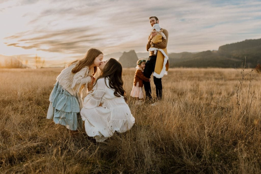 Mom and daughter in blue and white dresses kissing while the rest of the family play in the background
Colors to Avoid (Or Use Sparingly) in Family Photos
Drawing from years of observing family photoshoots, I’ve noticed certain colors can detract from the overall aesthetic. While personal preferences vary, some colors consistently pose challenges in photography. It’s important to note that these are general guidelines, and small accents of these colors can be perfectly acceptable.
Black: While classic, black can sometimes absorb too much light, making images appear dull. Details in black clothing can also get lost in shadows. Black pants or shorts are generally fine, but avoid full black outfits.
Dark Blue: Similar to black, very dark blue can lack vibrancy in photographs and obscure details. However, denim and lighter shades of blue are usually not problematic.
Neon Colors: Neon shades are incredibly eye-catching and can be distracting, pulling focus away from the subjects. They can also reflect harsh colors onto skin tones, creating an unflattering effect. It’s best to avoid neon in all clothing items, even shoe accents.
Bright White: Surprisingly, bright white can appear blueish in photos and be difficult to edit to look truly white. It can also be overly reflective, washing out skin tones and creating unwanted bright spots. Off-white, cream, or textured white fabrics like lace are much more photo-friendly.
Bright Red: Red is notoriously challenging to photograph. It tends to cast red tones onto skin, similar to neon colors. Darker reds, like burgundy or maroon, are generally more flattering and photograph beautifully.
Bright Blue: While blue is a common color, very bright blues can feel unnatural, especially in outdoor settings. They can also create a cooler tone in photos, which may not be desired if you prefer warm and inviting images. Muted blues and teals tend to work better.
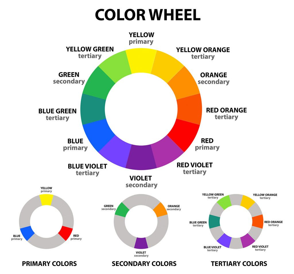
Understanding the Color Wheel for Harmonious Family Photos
For those interested in the science behind color coordination, the color wheel is an invaluable tool. It helps visualize color relationships and choose palettes that are visually appealing.
 color wheel helping you understand what colors to wear
The color wheel demonstrates how colors relate to each other, enabling you to select combinations that are either harmonious or intentionally contrasting. The key is to choose muted or toned-down versions of the colors on the wheel for clothing, as the wheel itself displays very saturated hues.
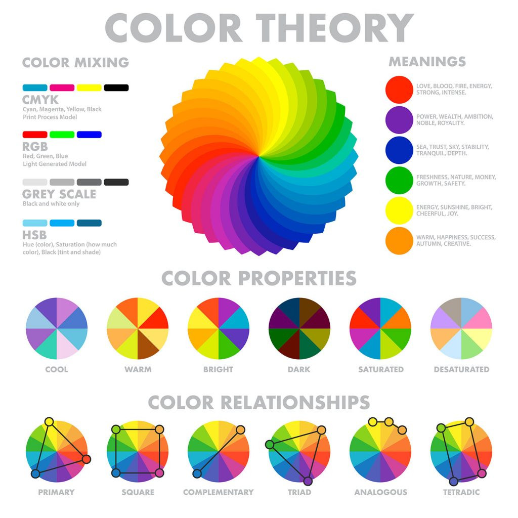 color wheel, color theory diagram
Applying Color Relationships to Family Portrait Outfits
Here are several color relationships from the color wheel that you can use to guide your Family Portrait Color Schemes:
Complementary Colors: These are colors directly opposite each other on the color wheel, like red and green, or blue and orange. Complementary schemes create contrast and make each color stand out. For family photos, use one color as the base and incorporate the complementary color as an accent to avoid overwhelming the image. Example: Olive green and maroon create a sophisticated complementary palette.
 family wearing complimentary colors playing with their baby boy
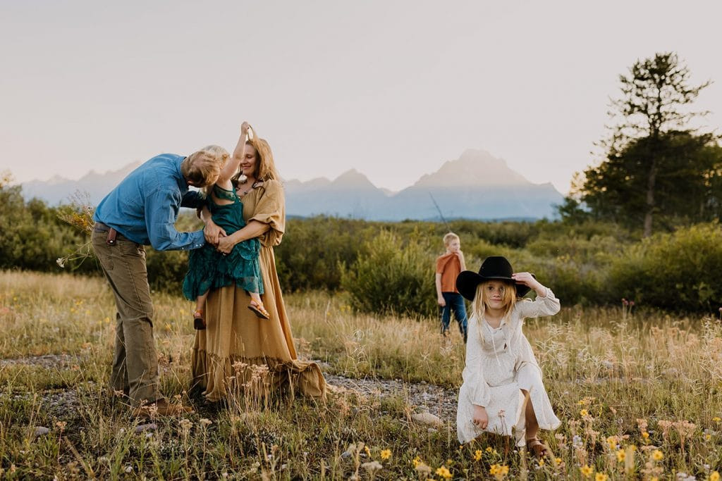
Triadic Colors: A triadic scheme uses three colors equally spaced on the color wheel, forming a triangle. This creates a vibrant and balanced palette. Similar to complementary schemes, it’s best to choose one or two dominant colors and use the third sparingly for accents. Example: Turquoise, yellow-orange, and pink create a cheerful and energetic triadic combination.
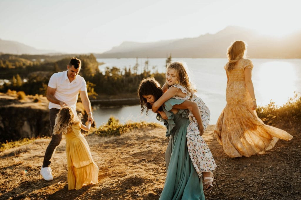 family dancing and playing near cliff wearing yellow, turquoise and white dresses
Square and Tetradic Colors: These schemes use four colors, forming a square or rectangle on the color wheel. Tetradic schemes can be complex but offer rich and diverse palettes. For family photos, it’s wise to select two dominant colors and use the other two as subtle accents, or opt for very muted versions of all four colors. Example: Muted blue, purple, orange, and yellow create a subtle tetradic palette that’s pleasing without being overwhelming.
 Family of five wearing pastel colors standing with greenery around them
Analogous Colors: Analogous schemes use three colors that are adjacent to each other on the color wheel, such as yellow, yellow-orange, and orange. These create harmonious and soft color palettes, perfect for a subtle and cohesive family portrait look. Example: Shades of red-orange, orange, and yellow-orange, mirroring a warm sunset, create a beautiful analogous scheme.
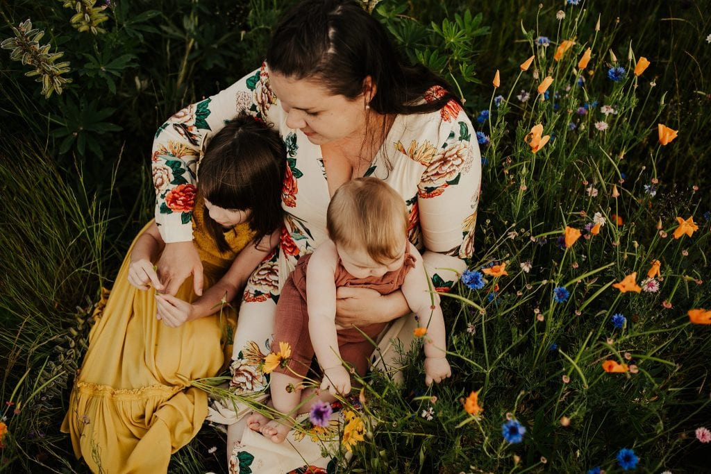 Mom holding her two kids who picked yellow and brown colors for their photo shoot
Monochromatic Colors: A monochromatic scheme uses different shades and tints of a single color. This is a simple yet elegant option for family photos, creating a unified and sophisticated look. You can use monochromatic schemes for part of the family and introduce neutral colors or other monochromatic schemes for the rest. Example: Varying shades of pink and blue, combined with neutrals, create a balanced monochromatic look with depth.
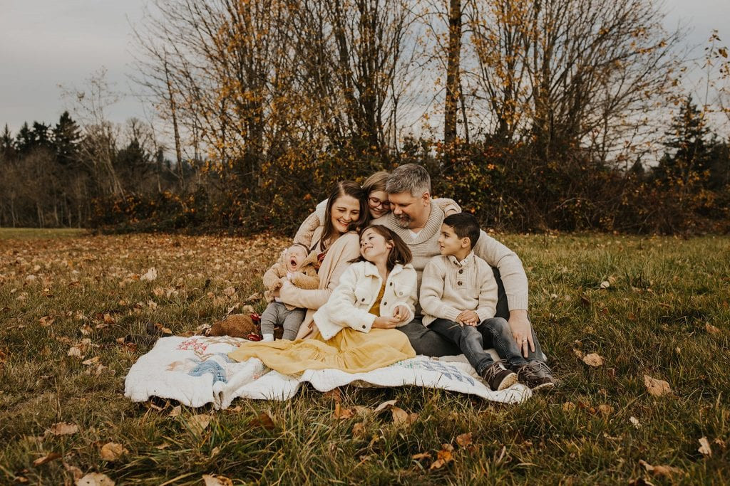
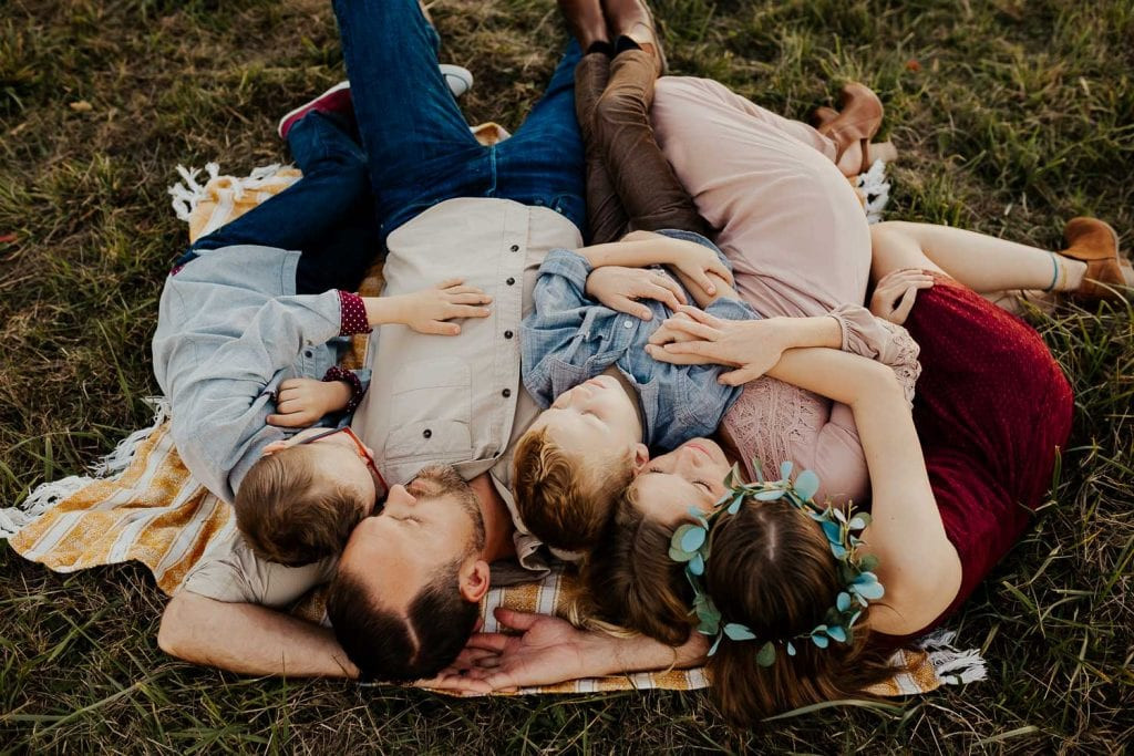 Family laying on a blanket together
These color relationships are excellent starting points for choosing your family portrait color schemes. Don’t hesitate to experiment and see what combinations resonate with your personal style and the location of your photoshoot.
The Timeless Appeal of Neutral Colors in Family Portraits
Neutral colors, also known as earth tones, are your best friend when planning family photo outfits. These colors are versatile, easy to coordinate, and create a classic and timeless look. Neutrals include shades like off-white, cream, beige, gray, taupe, and browns. They harmonize effortlessly and allow the focus to remain on your family’s faces and interactions.
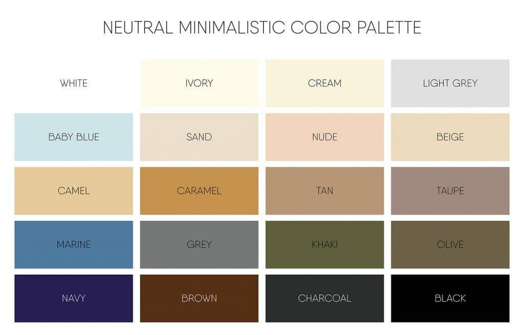 neutral earth tones color scheme diagram
Opting for mostly or all neutrals is the easiest path to a well-coordinated family portrait. Neutrals inherently complement each other, eliminating the guesswork in color matching.
Here are examples of families styled in all-neutral color schemes:
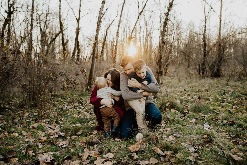
 Family wearing all neutral colors swinging their little boy between them
 Family wearing an all neutral color scheme sitting on a blanket in a field
And here are examples of incorporating a pop of color into a predominantly neutral scheme:
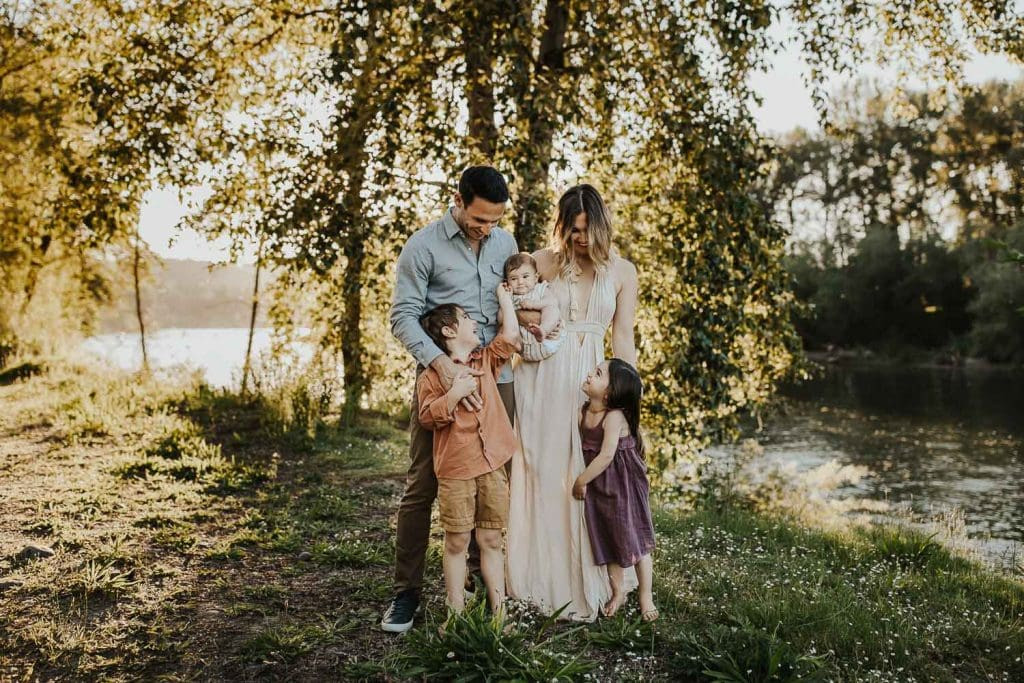
 family of three at the river
 Family ticking each other and hugging while wearing a neutral color scheme with one pop of color
However, don’t shy away from bolder palettes when balanced correctly:
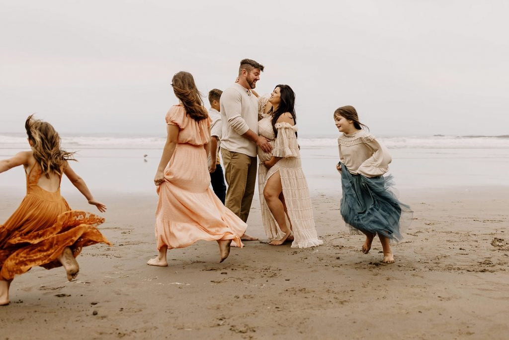
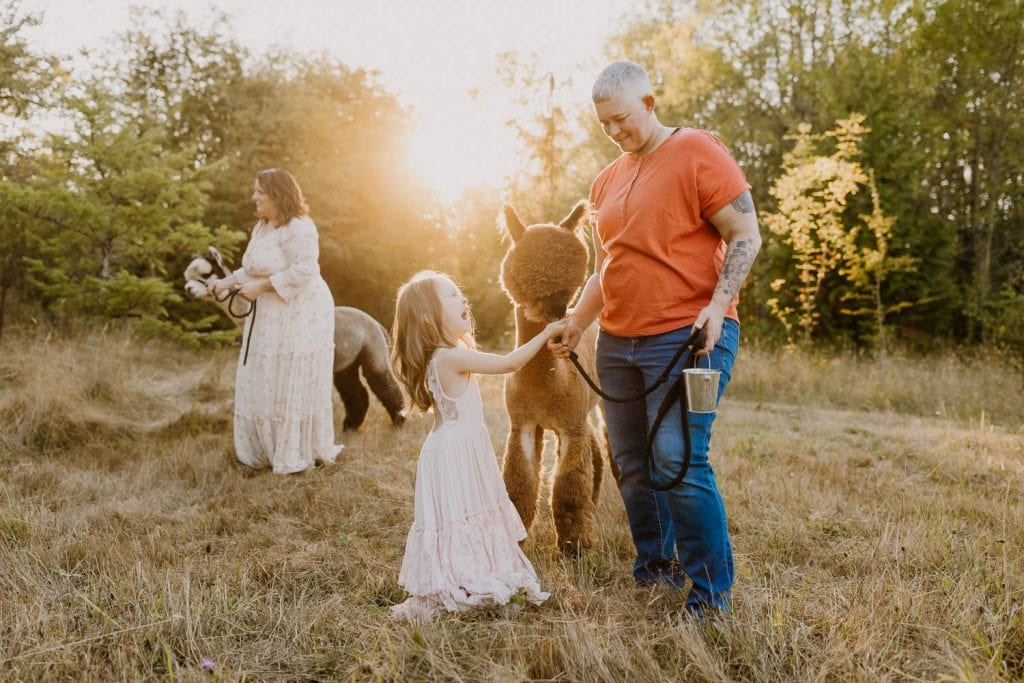 two moms and their daughter wearing bold colors and playing with alpacas
And examples of balanced bold and neutral color schemes:
 family wearing pretty color scheme playing together in the mountains
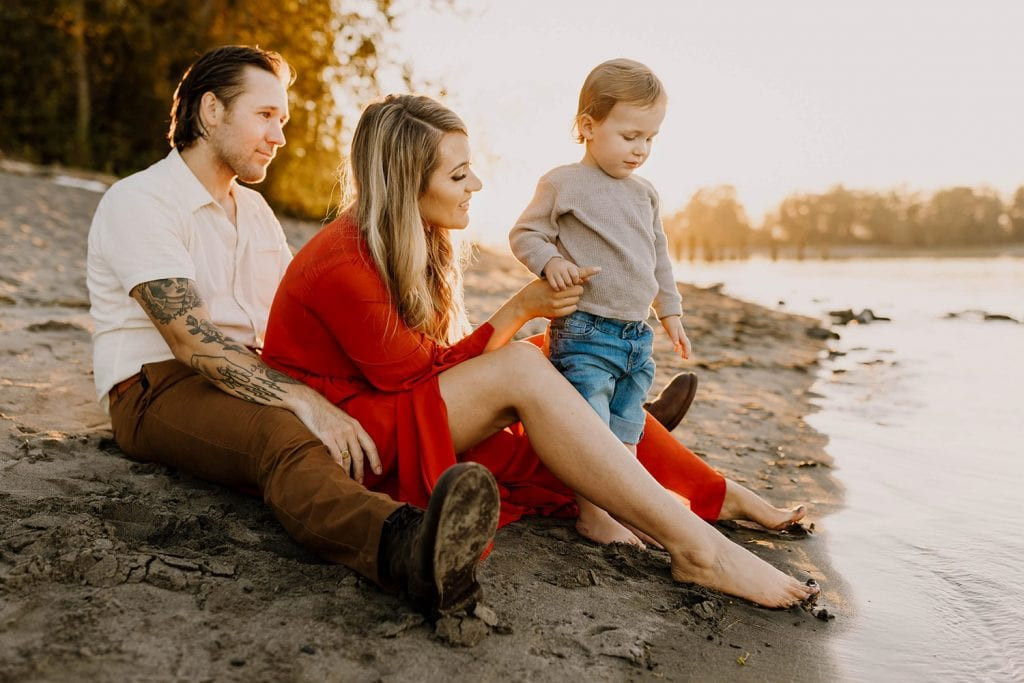
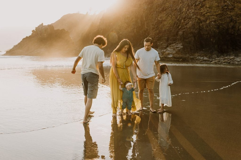 family playing at the beach
 Large family dressed in neutral color scheme with a pop of color at the beach
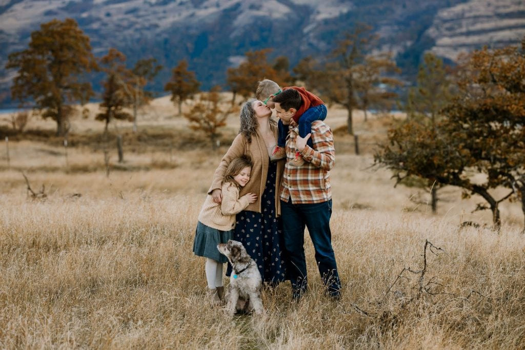 Family hugging in a golden field with mountains behind them
Neutrals or Bold Colors: Striking the Right Balance for Family Photos
While neutral color schemes offer ease and elegance, incorporating pops of color can add personality and vibrancy to your family portraits. The key is balance. Overloading on bold colors can be visually overwhelming, while a thoughtful mix of neutrals with strategic color accents creates dynamic and engaging images. Aim for a harmonious blend where neither neutrals nor colors dominate excessively.
Inspiring Color Scheme Ideas for Your Family Photos
To spark your creativity, here are some curated color schemes perfect for family photos. Remember to adjust the number of colors and the boldness based on your family size and personal preference. These are excellent starting points to inspire your outfit selection:
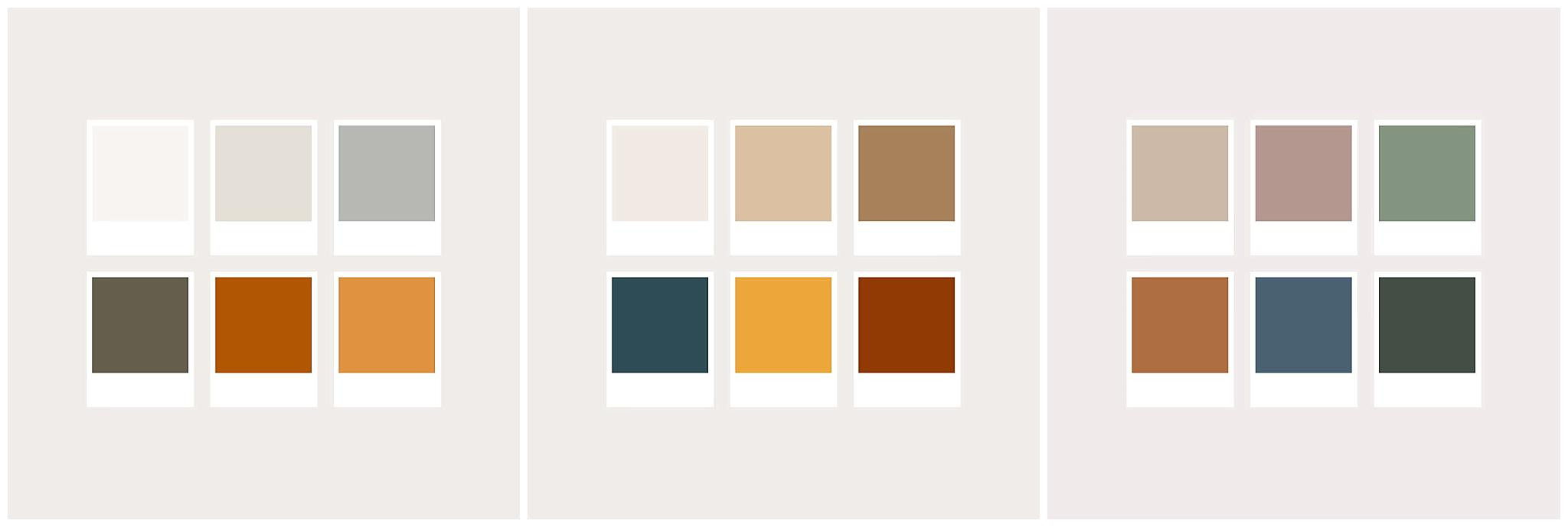 colors that look good for photos
Where to Shop for Family Photo Outfits
Finding the perfect outfits can be exciting! Many retailers offer stylish and photo-ready clothing options. Consider exploring stores like Zara and H&M for trendy pieces, Target and Banana Republic for versatile men’s and women’s wear, and Joyfolie, Rylee + Cru, and Jamie Kay for charming children’s clothing. For women, Free People, Baltic Born, and ZeBuBeYou offer beautiful and unique dresses and separates.
For quick and convenient options, Amazon is a treasure trove of clothing. You can find curated lists for men, women, and children, making it easy to shop for coordinated looks.
When it comes to shoes, brown tones are universally flattering in photos. White sandals work well for women and children, while men should avoid bright white shoes. Comfortable and stylish brands like Amberjack for men and B.O.C. ankle boots for women are great choices. For babies and children, Adelisa & Co offers adorable leather shoes that photograph beautifully.
Explore More Family Photo Outfit Inspiration
If you’re seeking further guidance on family photo outfits beyond color schemes, explore these helpful resources:
- Patterns: What to Wear for Family Photos
- What to Wear for Maternity Photos
- What NOT to Wear for Photo Sessions
- What to Wear to Your In-Home Lifestyle Session
- How to Prepare for Your Overcast Photo Session
- How to Dress for Winter Family Photos
These articles offer comprehensive advice on various aspects of family photoshoot attire.
Capture Your Family’s Memories
Choosing the right color schemes is a significant step in creating beautiful family portraits. By understanding color relationships and considering the advice in this guide, you can confidently plan outfits that will result in stunning and memorable photos. Start planning your family portrait color schemes today and prepare to capture timeless memories!