Family Feud stands as a cornerstone of American television, captivating audiences since its debut in the mid-1970s. Its simple yet engaging premise—two families battling it out to guess the most popular survey answers—has resonated across generations and cultures. Originally a US phenomenon, Family Feud’s format has been successfully adapted and broadcast in numerous countries worldwide, each version carrying the essence of the original while often tailoring the presentation to local audiences.
The Evolution of the Family Feud Logo: A Visual Journey Through Decades
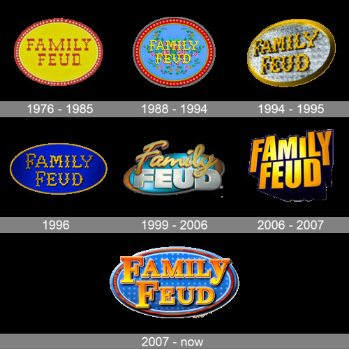 Family Feud Logo History Over the Years
Much like the show itself, the Family Feud Logo has undergone several transformations, reflecting changing design trends and the show’s own evolution. Since its inception in 1976, the logo has been redesigned multiple times, yet it has consistently maintained a degree of recognizability, often anchored by the use of an oval medallion shape. Interestingly, one iteration briefly deviated from this oval theme, showcasing the brand’s willingness to experiment while ultimately returning to its established visual identity.
1976 – 1985: The Wild West Banner Era
 Family Feud Logo 1976 – First Logo Design
The inaugural Family Feud logo, launched in 1976, embraced a distinctive Wild West aesthetic. This first logo, used for nearly a decade, featured a yellow and red banner design. At its heart was a solid yellow medallion, outlined with an ornate red frame. The show’s name was emblazoned within the medallion in red, uppercase letters, utilizing a unique “wishbone” typeface that added to the logo’s playful and slightly retro feel.
1988 – 1994: Embroidered Elegance Takes Center Stage
 Family Feud Logo 1988 – Embroidered Style Logo
In 1988, a significant redesign maintained the oval shape but ushered in a calmer, more refined style. The color palette shifted to incorporate a blue embroidered-looking background, framed in dark red and punctuated by white dots along the perimeter. The “Family Feud” wordmark was rendered in yellow, also stylized to mimic embroidery, creating a cohesive and textured visual identity. This logo conveyed a sense of tradition and homespun charm.
1994 – 1995: A Brief Glimmer of Gold and Silver
 Family Feud Logo 1994 – 3D Metallic Logo Design
The 1994 logo redesign adopted a more modern, three-dimensional approach. The medallion gained volume and a glossy finish, transitioning to a silver background with gold lettering and a matching gold frame. This iteration, while short-lived, marked a move towards a more contemporary and luxurious aesthetic, adding a touch of polish to the Family Feud brand.
1996: Electric Blue and Glossy Gold Emerge
 Family Feud Logo 1996 – Electric Blue and Gold Version
The 1996 emblem retained the embroidered style and horizontal oval shape but dramatically altered the color palette. A deep, electric shade of blue, enhanced with gradients, became the dominant color, contrasted with a yellowish gold for accents and lettering. This combination created a bright, glossy, and energetic logo, injecting a dose of modern vibrancy into the brand’s visual identity. Like its predecessor, this version also had a brief lifespan.
1999 – 2006: Metallic Blue and Cursive Script
 Family Feud Logo 1999 – Metallic Blue and Gold Logo
The 1999 redesign maintained the glossy gradients and three-dimensional feel, but modernized the concept and color scheme further. The oval was refined and rendered in metallic blue with partial dark gold framing. The wordmark was restyled, presenting “Family” in a golden cursive script above “Feud,” which was rendered in massive, silver, sans-serif capital letters. This logo felt contemporary and dynamic, balancing elegance with boldness.
2006 – 2007: Breaking from the Oval Tradition
 Family Feud Logo 2006 – Square Lettering Logo Design
The 2006 redesign marked a significant departure, eliminating the oval medallion entirely. This logo consisted solely of voluminous, square lettering arranged in two levels. All characters were depicted in a gradient gold, outlined in a dark purple-to-black shade, and featured prominent geometric drop shadows. This version was a bold, graphic statement, moving away from the traditional medallion towards a more typographical approach.
2007 – Present: Return to the Classic Medallion
 Family Feud Logo – Current Logo with Oval Medallion
In 2007, the iconic oval medallion made a triumphant return to the Family Feud visual identity and remains in use today. This iteration features a glossy blue background with a substantial reddish frame and three-dimensional lettering in yellow and orange gradients. The typeface is a bold, geometric serif, conveying both strength and familiarity. Variations of this logo exist, featuring darker backgrounds and intensified color shades in the wordmark, offering subtle adjustments while maintaining the core design.
Font and Color Palette: Building Brand Recognition
The primary Family Feud logo utilizes a bold yet refined serif typeface for its wordmark. The lettering, presented in title case, evokes a sense of classic television branding. Fonts closely resembling the Family Feud logo font include Clarendon Bold and Georgia Pro Bold, both known for their strong, legible, and slightly vintage character.
The consistent color palette of the Family Feud logo centers around combinations of blue and yellow, often incorporating gradients to add depth and visual appeal. This bright and contrasting color scheme contributes to the logo’s friendly and energetic feel, mirroring the lively and engaging nature of the game show itself. The use of these colors helps to ensure the logo is eye-catching and memorable across various media platforms.

