
Choosing the right colors for your family photos can feel like a daunting task. As a family photographer with years of experience at hudsonfamily.net, I understand the overwhelm. You want your photos to look timeless, cohesive, and to truly reflect your family’s personality. That’s why I’ve put together this guide to help you navigate the world of color and confidently choose the best color combos for your upcoming family photoshoot. Forget stressing over outfits – let’s dive into creating stunning family photos with perfectly coordinated colors!
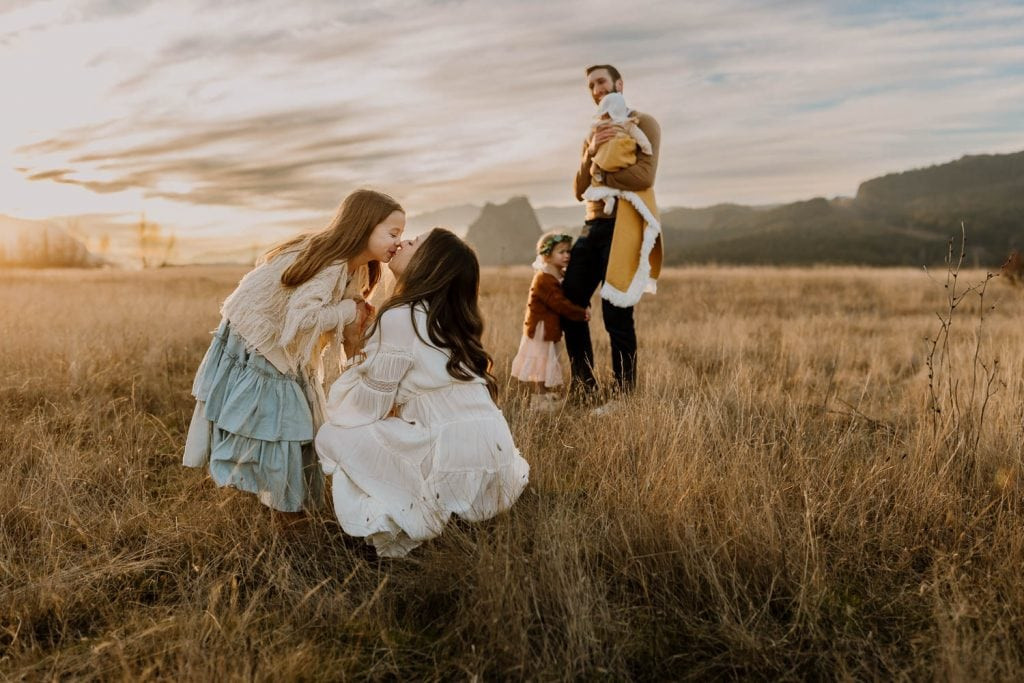 Mom and daughter in blue and white dresses kissing while the rest of the family play in the background
Colors to Consider Avoiding (Or Using Sparingly)
Before we jump into the exciting part of choosing colors, let’s talk about some colors that, based on my experience, can be a bit tricky in photos. Keep in mind, these are general guidelines and personal preferences developed over years of photographing families, but every photographer has their own style.
Black: While black is a classic and sophisticated color, in photographs, especially outdoors, it can absorb light and appear very heavy. Details in black clothing can get lost in the shadows, resulting in a less dynamic image. Small accents of black are perfectly fine, but avoid large blocks of black clothing like dresses or shirts if possible. Black pants or shorts are generally acceptable as they are further from the face.
Very Dark Blue: Similar to black, very dark blues can also lack dimension in photos and make images appear darker overall. Again, small amounts are usually fine, and denim jeans are an exception and work well as a neutral base.
Neon Colors: Neon colors are incredibly vibrant and eye-catching, but this vibrancy can be distracting in photos. Neon clothing tends to draw attention away from faces and can even cast unflattering colors onto skin tones. It’s best to avoid neon altogether, even on accessories or shoe soles.
Bright White: Surprisingly, bright white can be challenging in photos. It often reflects a lot of light and can appear almost blueish in images. This can require extra editing to correct and can sometimes wash out skin tones. Opting for off-white, cream, or textured white fabrics like lace can mitigate this issue and add visual interest.
Bright Red: Red is a powerful color, but it’s also one of the most difficult to photograph accurately. Bright reds, like neons, can cast unwanted color tints onto skin and be overpowering in the frame. Deeper, muted reds, like burgundy or maroon, however, can be beautiful and add warmth.
Bright Blue: While blue is a popular color, very bright blues, especially in large amounts, can feel unnatural in outdoor settings and can cool down the overall warmth of an image. My personal preference leans towards warmer tones in family photos, so I generally advise against dominant bright blues unless they are balanced with warmer hues.
Understanding the Basics: The Color Wheel
For those who want a deeper understanding of color theory, let’s briefly explore the color wheel. If you’re not interested in the theory, feel free to skip to the next section on color relationships.
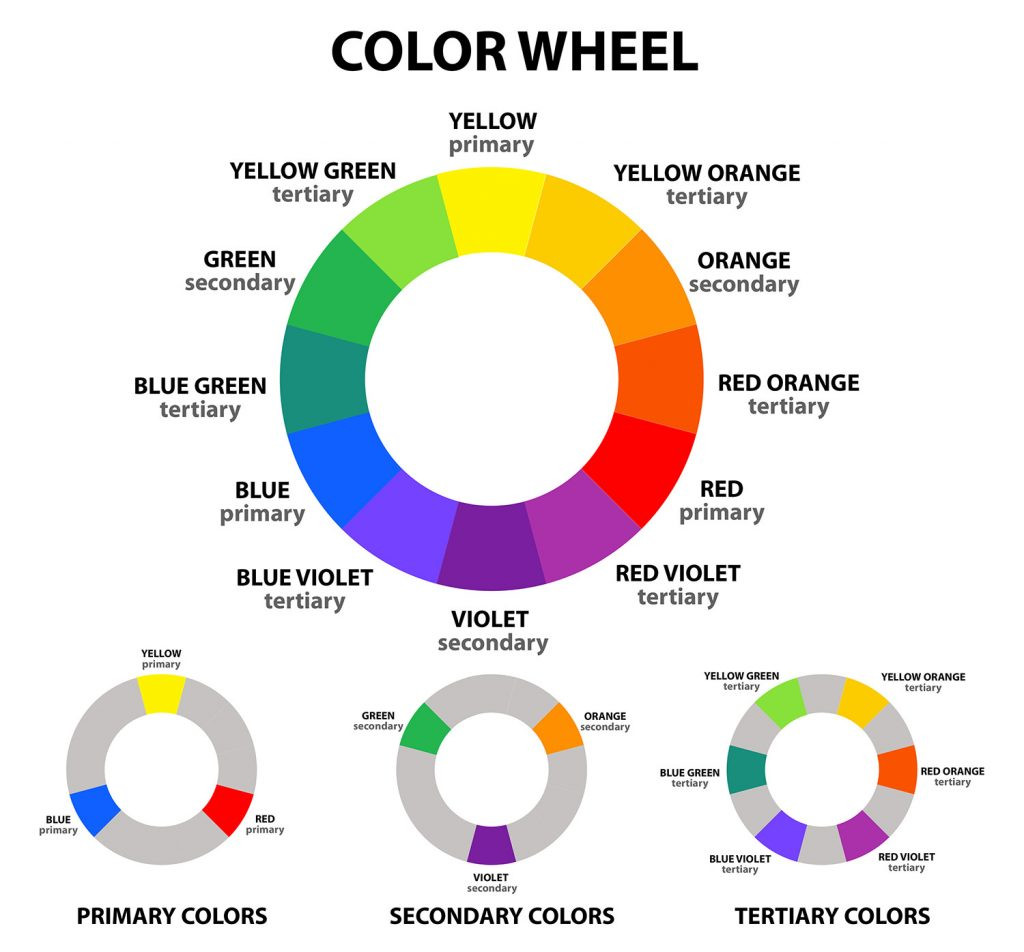 color wheel helping you understand what colors to wear
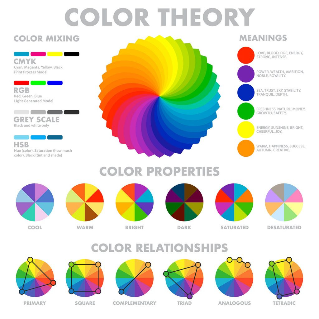
The color wheel is a visual representation of colors arranged according to their chromatic relationships. It’s a fantastic tool for understanding which colors work well together. You can use various color schemes based on the color wheel to create visually appealing outfits. Remember that the colors on a standard color wheel are very saturated, and for photos, you’ll generally want to choose more muted or toned-down versions of these colors.
 color wheel, color theory diagram
Harmonious Hues: Using Color Relationships for Family Outfits
Now, let’s explore some specific color relationships from the color wheel that you can use as a guide for choosing your family photo outfits.
Complementary Colors: These are colors located directly opposite each other on the color wheel, like red and green, or blue and orange. Complementary color schemes create a vibrant and dynamic look due to their high contrast. For family photos, it’s best to use one complementary color as the main color and the other as an accent. For example, you could have a base of olive green with accents of maroon.
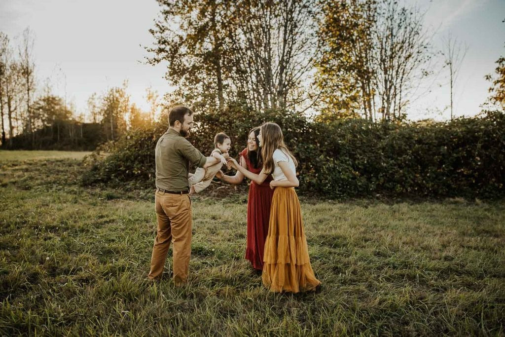 family wearing complimentary colors playing with their baby boy
Triadic Colors: A triadic color scheme involves three colors that are equally spaced apart on the color wheel, forming an equilateral triangle. Examples include orange, green, and purple, or yellow-orange, turquoise, and pink. Triadic schemes are bold and balanced. Similar to complementary colors, use one or two as dominant and the others as accents to avoid overwhelming the image. The example below uses turquoise and yellow-orange beautifully, with pink accents in the flowers.
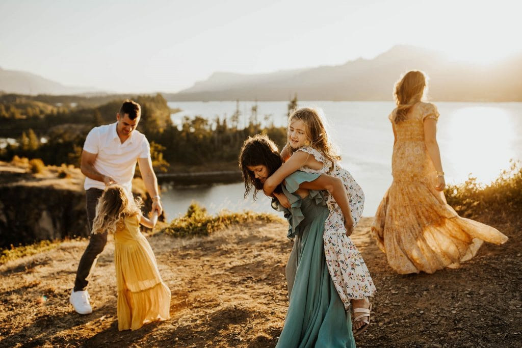 family dancing and playing near cliff wearing yellow, turquoise and white dresses
Square and Tetradic Colors: These schemes use four colors arranged in a square or rectangle on the color wheel. Tetradic schemes offer rich and diverse palettes. For family photos, they can be a bit complex to manage if you’re not careful. The key is to choose muted versions of the colors and to use one or two as dominant colors, with the others as smaller accents or in patterns. The example below showcases a muted tetradic scheme with blue, purple, orange, and subtle yellow.
 Family of five wearing pastel colors standing with greenery around them
Analogous Colors: Analogous colors are groups of three colors that are next to each other on the color wheel, like yellow, yellow-orange, and orange, or blue, blue-violet, and violet. Analogous schemes are harmonious and subtle, creating a soft and blended look. The example below uses shades of red-orange, orange, and yellow-orange for a warm and cohesive feel.
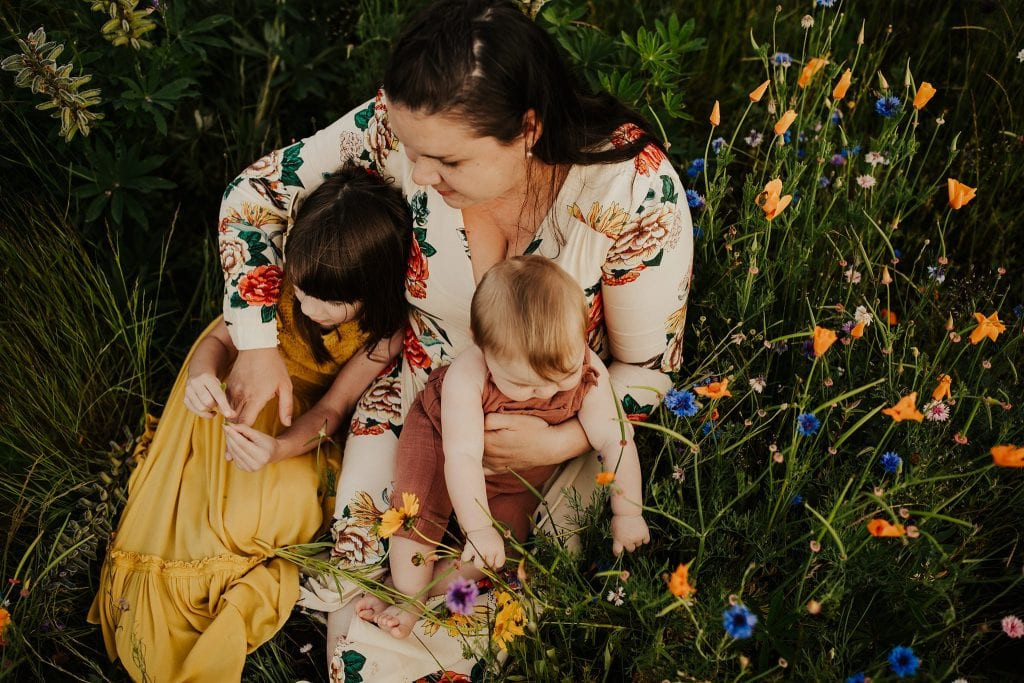 Mom holding her two kids who picked yellow and brown colors for their photo shoot
Monochromatic Colors: Monochromatic color schemes use different shades and tints of a single color. This is a very sophisticated and easy-to-coordinate option. For family photos, you can dress individuals in varying shades of the same color, adding depth and visual interest. For example, mom in a dark green dress, baby in a light green romper, paired with neutrals for other family members. The example below uses monochromatic pinks and blues combined with neutrals.
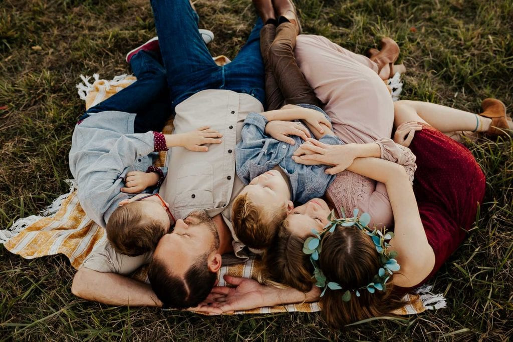 Family laying on a blanket together
These color relationships are just starting points. Feel free to experiment and adapt them to your family’s style and preferences. And if you’re ever unsure, don’t hesitate to ask your photographer for guidance!
The Power of Neutrals: Your Wardrobe Workhorse
Neutral colors are your best friend when planning family photo outfits. Often referred to as earth tones, neutrals are colors that aren’t strongly saturated and tend to blend well with almost anything. Think of colors like off-white, cream, beige, gray, taupe, tan, brown, olive, and muted shades of blue and green.
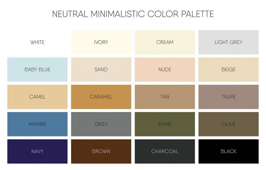 neutral earth tones color scheme diagram
Using mostly or all neutrals is the easiest way to achieve a cohesive and timeless look for your family photos. Neutrals are incredibly versatile and work beautifully in almost any setting. They allow the focus to remain on the faces and connections within your family, rather than competing with brightly colored clothing.
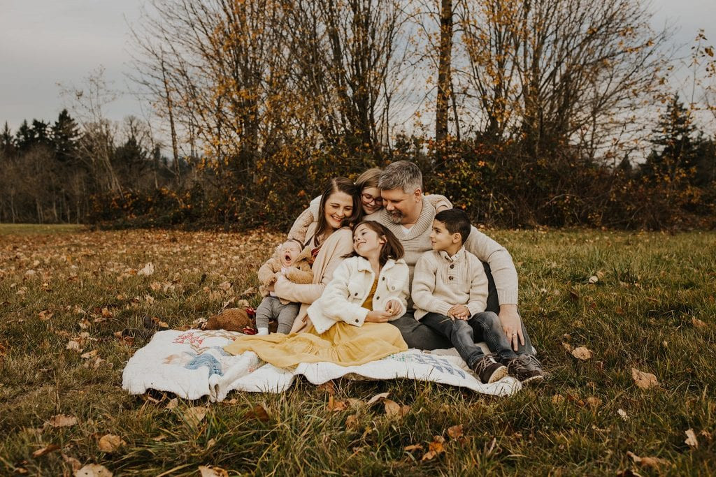
Here are examples of families styled in all neutral color schemes:
 Family wearing all neutral colors swinging their little boy between them
 Family wearing an all neutral color scheme sitting on a blanket in a field
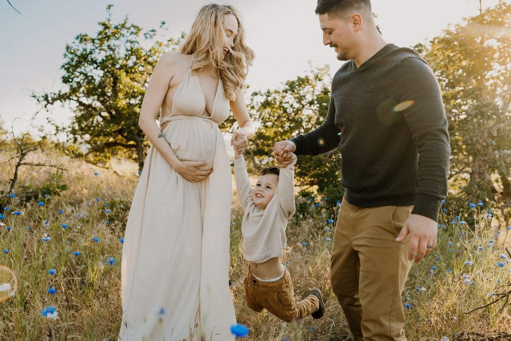
And here are examples where neutrals are the base, with a single “pop” of color added:
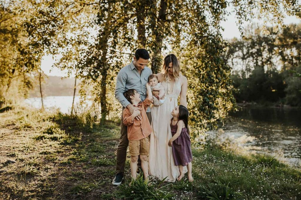
 family of three at the river
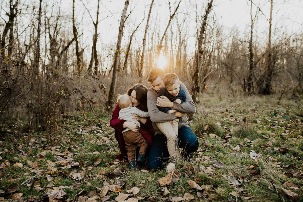 Family ticking each other and hugging while wearing a neutral color scheme with one pop of color
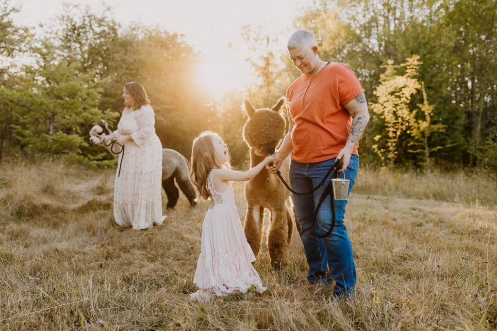 two moms and their daughter wearing bold colors and playing with alpacas
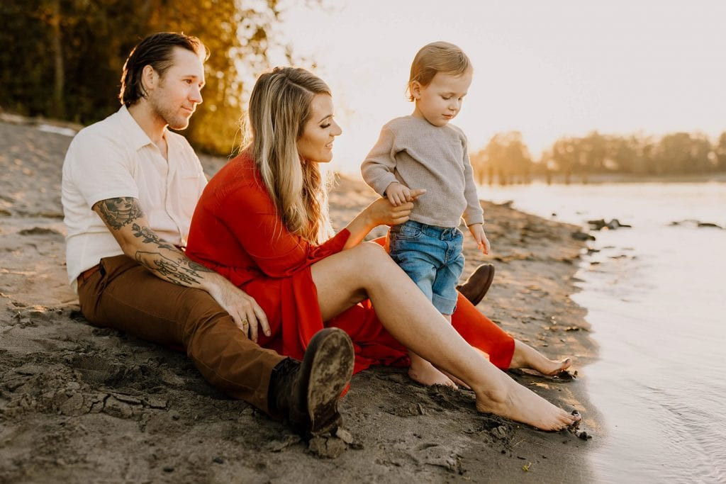
Finally, here are examples of families who have balanced bolder colors with neutrals beautifully:
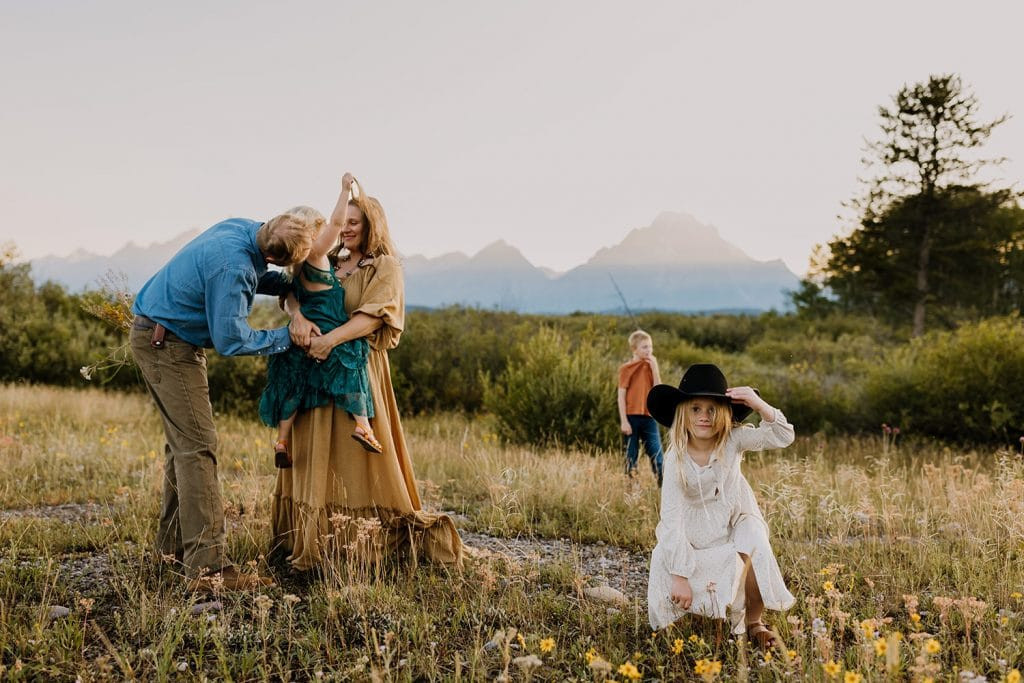 family wearing pretty color scheme playing together in the mountains
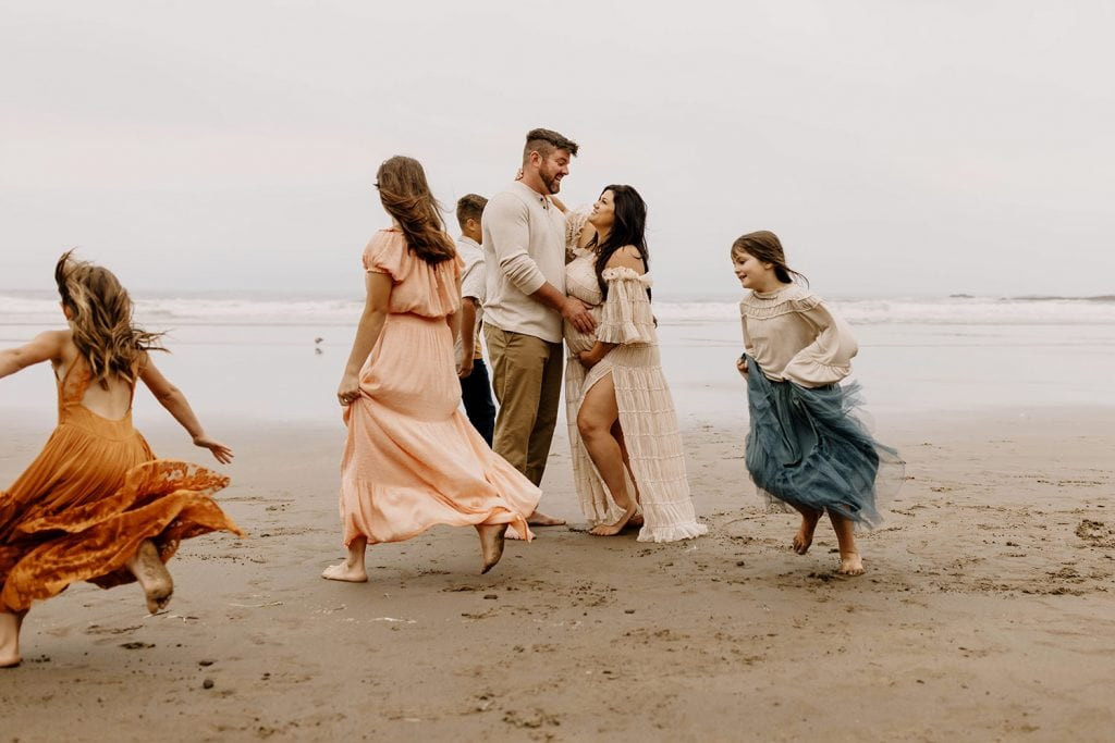
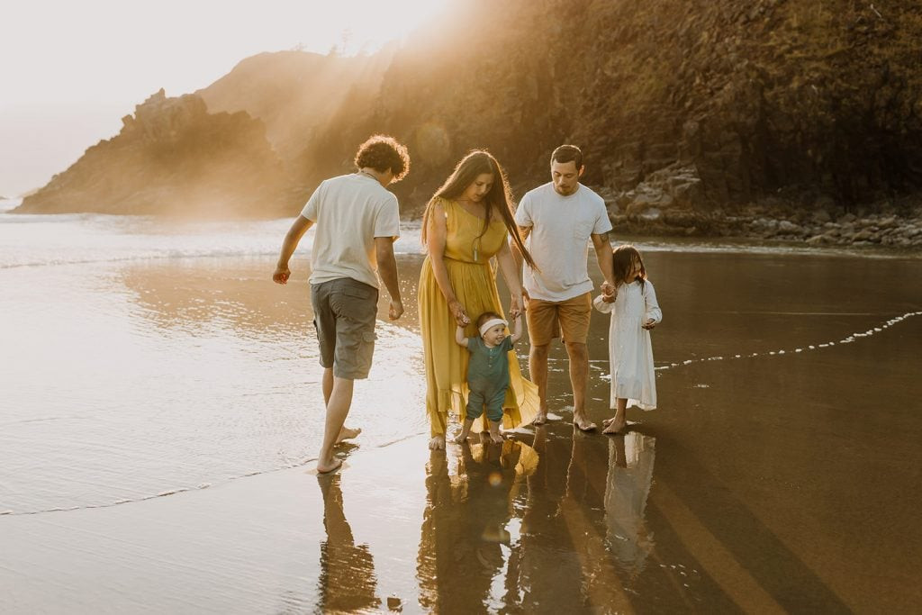 family playing at the beach
 Large family dressed in neutral color scheme with a pop of color at the beach
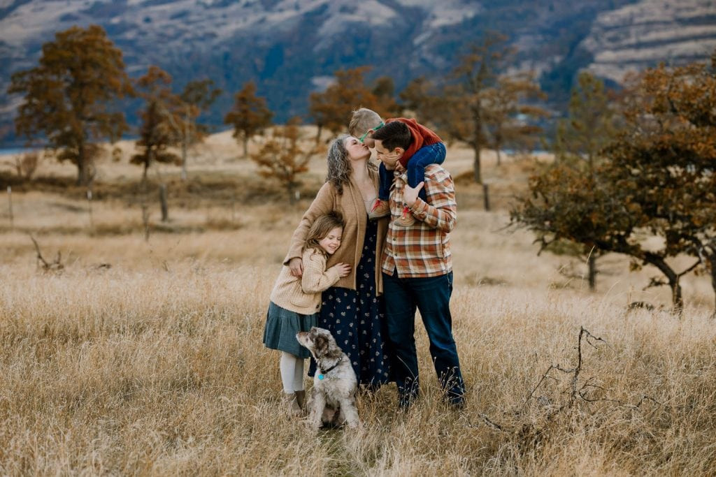 Family hugging in a golden field with mountains behind them
Neutrals or Bold Colors: Which is Best for Family Photos?
While all-neutral palettes are classic and safe, I personally love incorporating color into family photos! Neutrals provide a beautiful foundation, but adding pops of color or building a scheme with balanced colors can truly bring your photos to life and reflect your family’s personality. The key is balance. Avoid dressing everyone in head-to-toe bright colors. Instead, aim for a mix of neutrals and one or two carefully chosen colors.
Inspiration: Family Photo Color Scheme Ideas
To get you started, I’ve put together some color scheme ideas for family photos. These are meant to be inspirational starting points. Adjust the number of colors and the balance of neutrals to suit the size of your family and your personal preferences.
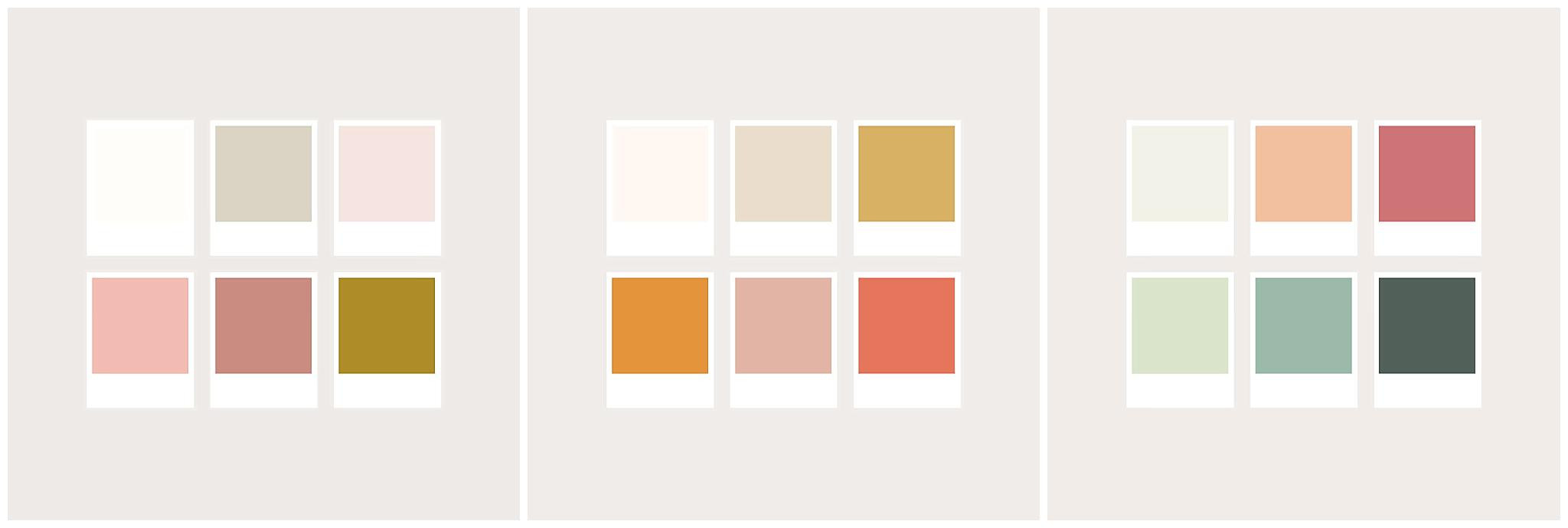 color schemes for family photography
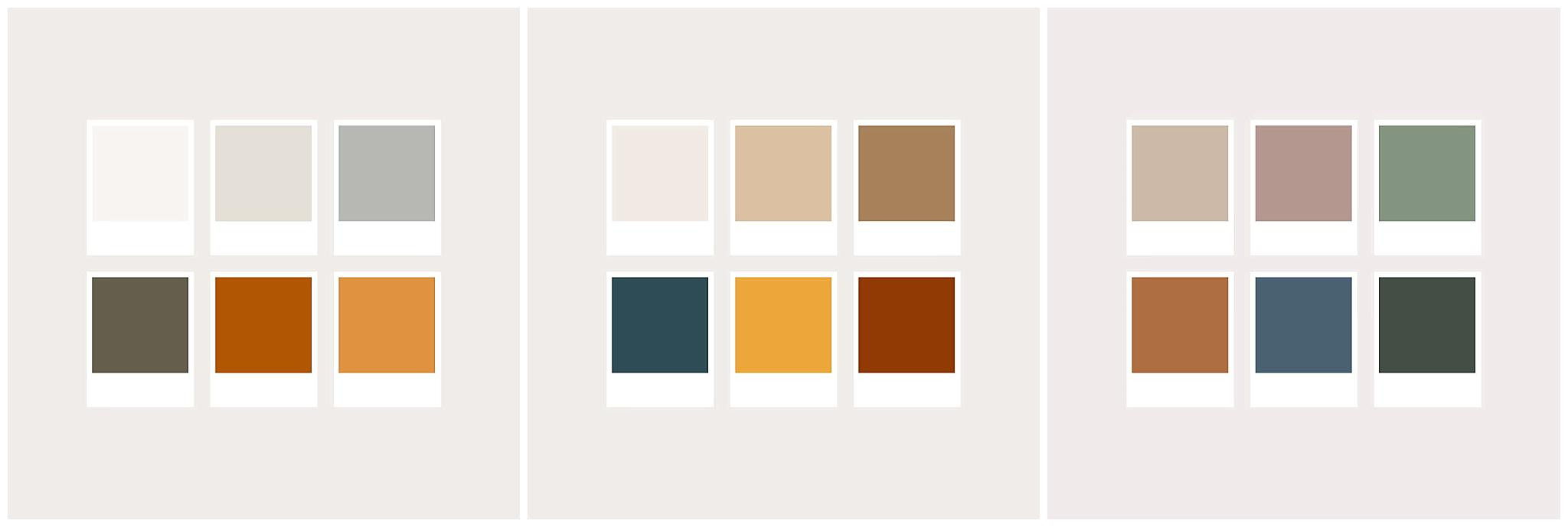 colors that look good for photos
Where to Find the Perfect Outfits
Finding clothing for family photos can be part of the fun! Here are some stores to get you started, offering a range of styles and price points:
- Zara & H&M: Great for trendy and affordable options, especially for children’s clothing.
- Target & Banana Republic: Target is a fantastic all-around option, and Banana Republic often has classic men’s pieces like Henleys, button-downs, and sweaters.
- Joyfolie: Beautiful and whimsical dresses, especially for little girls and women.
- Rylee + Cru & Jamie Kay: Stylish and minimalist clothing for babies and toddlers.
- Free People, Baltic Born, ZeBuBeYou (Etsy): Excellent choices for women’s dresses with a bohemian, flowy, or unique feel.
- Amazon: For quick and convenient shopping, Amazon has a vast selection! (Check out my Amazon idea lists for men & boys, girls, and women – these are affiliate links).
For shoes, brown is almost always a fantastic choice for family photos. It’s versatile and photographs beautifully. White sandals can work for women and children. Avoid overly bright white shoes for men as they can be distracting. Black, gray, or colored shoes can work if they coordinate well with the outfits. Consider Amberjack for comfortable and stylish men’s shoes and B.O.C. ankle boots for comfortable women’s boots. For babies and children, Adelisa & Co offers adorable leather shoes that are perfect for photos.
Explore More Family Photo Outfit Inspiration
Want to delve deeper into outfit planning for family photos? Check out these related articles:
- Patterns: What to Wear for Family Photos
- What to Wear for Maternity Photos
- What NOT to Wear for Photo Sessions
- What to Wear to Your In-Home Lifestyle Session
- How to Prepare for Your Overcast Photo Session
- How to Dress for Winter Family Photos
You can also find more visual inspiration on my What to Wear page and my Pinterest board.
Planning your family photo outfits should be an enjoyable part of the process. By understanding color relationships and embracing a balance of neutrals and colors, you can create stunning and memorable family photos that you’ll treasure for years to come!